
A method of drawing and colouring with Photoshop
written by Jade ( http://www.zardec.net.au/aldas/ ) in 2004
last edited Jan 2011
STEP 1:
I mainly use Photoshop for my art so this tutorial is written with that program in mind, although hopefully you can use this method in other programs as well. I always draw straight onto the computer (using a tablet) rather than drawing something on paper and scanning it in, so my lineart will automatically be on a transparent layer.
I sketch very roughly at first:
Layer 1 is where I'm sketching, the background is currently blank white.
If you're scanning in your work rather than using a tablet, then this tutorial will explain how you can separate your lineart from the page you drew it on (ie. the lines will have transparent areas around them). This allows you to colour the lines later on, which creates a much softer and less cartoony effect than leaving them black.
If you don't mind having darker, single-colour lineart then you can skip the linked tutorial. Just put the lineart on the top-most layer and set it to "multiply" (a pull-down option at the top of the layers window).
Note: the bigger the dimensions of your canvas, the better quality your final result will be. The final size (before shrinking for the web) of the image I made for this tutorial was 1170 by 1436 pixels. Depending on whether your computer can handle large files and how much time you intend to spend on the image, you might make it anywhere from 300 to 3000 pixels wide.
STEP 2:
Making the sketch more detailed.

I used a small, hard brush at around 25% opacity for sketching, and since I'm being messy and just getting the basics down, I often use a lighter colour to sketch with rather than black.
The reason for this comes at the next step, when I want to clean up my linework:

On a new layer above the sketch, I use the same brush and opacity as I do when sketching and go over the lines I want. However, I use black this time (which is easy to see against the pale red), and am a lot more careful.
STEP 3:
Getting the base colour down.

Separate the image into sections of colour. Whichever areas are touching should not be on the same layer as one another (you'll see why this is important later on).
In this instance, I have my black outline on the top layer (normal setting), and my sketch layer on 30% opacity and multiply setting (I could throw the sketch out at this point, but I usually like to leave it in case I need to refer to it). Below that I have the hair and the purple of the robes on the same layer (which is fine since they aren't touching). Most of this colour was just blocked in with a large solid brush. Important: make sure the brush is at 100% opacity! Otherwise when you add a background behind your image later on, the background will show through your character slightly and make the image look worse. The parts that required careful colouring (especially the hair strands) were done with a smaller brush. Laying down the base colours will take a while, and is pretty boring, but doing this makes the future colouring a lot quicker and easier.
• Note for selecting base colours: 1) choose 'middle' colours – not too dark or too light, since you'll be adding both highlights and shadows to this layer. 2) don't worry if you don't like the colours you're using as the base. Just get them down, and later you can easily adjust them to whatever you want by using Photoshop's "Image>Adjustments>Hue/Saturation" section. This is one of the points in which not having two differently coloured areas touching really helps – if I wanted to change the robe colour for example, I would use the lasso tool to quickly select around it (but not the hair) then make the adjustments by using the hue slider. If I hadn't selected an area beforehand, the whole layer would be adjusted and the hair would end up green or another weird colour.
I find it's easiest to work from the front to the back (ie: do the parts that overlap other objects first), so once I finish the front parts (the hair and main part of the clothes) I create a new layer beneath this and start quickly slapping down some colour for the skin. You can be a lot messier than before, since you're colouring under the existing colours so you can go right up to and over the line of hair and clothes without making the image look bad. If you're having trouble finding the right skin tone, just use any colour you like and adjust it afterwards using the hue/saturation adjustment. It's a lot easier to push the sliders back and forward whilst checking the preview image until you find a skin tone that looks nice, than it is to try and pick the correct tone first go from the colour/gradient selection.
After that, I added another layer below this, called accessories (usually I don't bother naming my layers, but this is to make it easier to follow the screencaps of this tutorial). You can name your layers by going to Layer>Layer Properties or by clicking on their names, which can be useful when you're trying to keep track of which layer is responsible for what.
The accessories layer doesn't really contain any accessories at the moment, it's just the cuffs and collar of the jacket, as well as his hair tie. If your character is wearing jewellery or something that goes over the clothes/hair, you'll need to put it on a layer above the other base colours.
Note: parts of the image that I intend to be white, or close to white, I colour in with a much darker colour so that I can clearly see them against the white background and check that I'm not missing any spots. The socks and sword for example, I coloured in dark grey/blue at first.
STEP 4:
The background.
At this point you're probably wondering "background?! Doesn't that come last?". Many people do leave the background till last, and completely finish the character first. However, if you leave it to last you can have trouble making the character look like they 'belong' in the background. In a quite a few anime fanarts you'll see either a character on its own, or a character with a landscape photo or some other quickly done background behind them. This is fine, but if you want to produce an illustration as a whole image, rather than just a character portrait, then it's important to pay just as much attention to the background as to the person in front of it.
Lately I've done a few images where I completely draw and colour a bg without thinking much about the character. This gave me nice and detailed backgrounds (this and this were both done background first for example) but unfortunately a result of this is that the character tends to be drawn worse and have less effort spent on them. So, my new process is to draw both the character and background early on and have neither one dominating the other.
If you're stuck for background ideas, searching for scenery photos in the image section of google is a good place to start. It helps if you have a rough idea of what you want, so that you can search for more specific scenery, such as "Japan cherry blossom park" as a really stereotypical example!
For this samurai picture, I was thinking he'd either be sitting on the steps outside a traditional Japanese dojo, or sitting on some rocks in an outdoors setting.

I've decided on the outdoors scene, so I do a rough sketch of the background to work out the composition. Try to balance out your image – ie: if your character is to the left, I put more focus on the right hand side of the background. Just sketch until you're happy with the layout, because once you start colouring it becomes hard to make drastic changes.
Next, jot down some quick colouring to sort out the colour scheme you want. For most of it, I use a mid-hardness brush (ie: not the airbrushes, and not the hard edged brushes, but the hard ones with soft edges) and set it at 100% opacity.

If you find that your colour choice is too vibrant or the colours are clashing, you can go to Image>Adjustments>Hue/Saturation and either lower the saturation a bit, or change the background to being just one colour (click the "colourise" box, then adjust the hue slider to find the colour you like). You don't have to keep the bg as a monotone (though this can look nice) but it can be a good starting point if you're having trouble with a colour scheme, and you can later start adding in more colours by hand (eg. start with an all blue picture for a night time setting, then add some subtle dark green to the trees, pale yellow lighting from the moon, etc).
From then on it's just a matter of making more layers above this, and keep making your background more detailed.
Finished background:

Tips:
• Photoshop's brushes don't always give nice shapes, so try using the smudge tool (an image of a pointed finger in the toolbar, found by holding down the water droplet symbol to reveal the tools behind it) to improve your colouring. The tree leaves for example were quickly done with a large speckled brush, but at first they just looked like light sponge prints. I then used the smudge tool at around 30% to go over the leaves and sweep them into a different shape. In the process their edges were blurred a bit, which helped get them to pass for leaves.
• I avoid using the blur tool (a water droplet icon) for blurring anything. It usually leaves things looking too blurred and overly smooth for my liking. The smudge tool is a better choice – it provides blurring, but gives you more control and keeps the texture of your image intact rather than smoothing it all out. P.S. colouring with a hard solid brush and then using the smudge tool gives an oil paint effect!
• Avoid using the dodge and burn tools, especially if you're going for a more natural look. Stick to choosing highlight and shadow colours from the gradient palette (or if you get stuck, using the eyedropper tool to get colour from another image). Changing the layer effects (see the next dot point) can make this easier, though it gives you a bit less control over what colours you end up with.
• Layer effects: found in the drop-down menu at the top of the layers palette. Experiment with these to get an idea of what they do. "Overlay" is one of my favourite settings to use, since it's great for background lighting and provides very rich colour. Once you've done some or all of the colouring, try creating a new layer on the overlay setting, select a mid-range colour from your work so far, and paint over top of your existing colours. If you choose the right colour, you can really intensify your image this way. It's a bit like the dodge and burn tools, only much subtler and harder to overuse. For lighting, I mostly use overlay, soft light or hard light; for shadows, I mostly use overlay, multiply or darken.
STEP 5:
Finishing the character's colouring.
Select a layer to start colouring. Making sure the layer is highlighted in the layers palette, lock its transparency (the icon furthest to the left at the top of the layers palette, next to "Lock:").

Then it's just a matter of choosing a soft brush, a suitable colour that's darker than your mid/base colour, and applying the shadows onto the skin layer. (Note: with character colouring, I prefer to do all my highlights and shadows on the same base layer, rather than using multiple layers and effects). I do the same with the highlights, and just go over top with various colours til everything looks smooth. Keep in mind where your light source is at all times, or else your picture will look strange. In this case, the light is coming from behind him. A tip for choosing highlight and shadow colours: the shadow = roughly the colour of the surroundings (the sky, etc), the highlight = colour of the light source (usually pale yellow for sunlight).
With colouring the eyes, I usually lay down a mid colour that covers the pupil and iris area, then select a darker colour and add a few shadows around the outer edges and around the pupil. I then add a lighter colour in a sweeping curve around the lower part of the eye. Then I make a new layer above this (on normal setting) and use it to add the white highlights to the eye. One tip with highlights is that having them at the top of the iris gives the person a younger, more innocent look, and having them at the bottom makes the person look more mature.

You can make your eye colouring much more detailed than this if you want. This is just the basic method I use, and for images like this one the eyes are too small to bother with more detail.
For all your character colouring, it's good to have at least two darker shades for the shadows, and at least one colour for the highlights in order to get the best effect. When selecting different tones of a colour, it's helpful to travel in a diagonal direction on the colour picker. Eg. select the base colour, then move down and to the right by about 1 - 1.5 cm diagonally to get your first shadow colour, and travel up and to the left of the base colour by a similar amount to get your highlight colour.
Note: When colouring your image, don't use the dodge/burn tool if possible! Especially not for the skin. It usually makes your image look very cheap and artificial. Manually selecting colours generally gives you a much nicer result.
STEP 6:
Finishing touches.
At this point you check over your image, see if there are any parts where the colouring is messy or something has been left unfinished, and touch it up until you're happy. I use a new layer (at normal setting) on top of all the layers I've done so far, and make all my corrections onto that. This makes it easy to toggle the layer on and off to check whether you're happy with your corrections or prefer how the image was before.
Things you can add:
• Improvements in lighting. Avoid adding lens flares in unecessary places, but they can look nice when used subtly, and can be realistic when you have the sun in your picture. There are three different types of lens flares, and you can also adjust the intensity of them, so experiment to find out which one looks best (Filter > Render > Lens Flare). You can add light beams, glow or other features by painting them in a new layer using an airbrush and setting it to a suitable layer style (eg. screen or soft light).
• Changes to colour/tone. Go to Adjustments > Hue / Saturation and see if any changes to the contrast, saturation or hue of the picture give you a better appearance. Make sure the preview button is selected so you can see what you're doing, and turn it off and on to compare the modified version to the original before you say yes to the change.
Once I finished the colouring, I changed the colours around a bit until I was happy. The picture on the left is the original, the one on the right is the modified version:

• A border. Such as a simple straight-edged one (just go to Image > Canvas Size and add a constant value to the width and height. Eg. a 10 pixel border all around = +20 to width and height. Then fill this border in whatever colour you like. I always stick to black or white borders). You can also make a jagged edge by using some of the natural brushes that Photoshop provides, at a large brush size. Just paint in white around the sides.
An example of the border this method can create:

| Don't forget to sign your name, and then it's just a matter of saving the image. If you've been working at a very large size (eg: more than 1000 pixels wide) and you plan to post the image online, then you might want to resize your image (Image > Image Size) to something a bit smaller, so that it can be easily viewed by people with smaller monitors or slow internet. Then go File > Save for Web to get the lowest possible file size while keeping the quality decent. If possible, try to keep your image at 100kB or less if it's small (ie: 500 pixels wide or less) and under 200kB for larger pictures. | 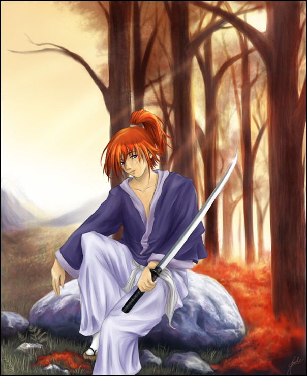 Finished Image, 130kb, 604 x 741 pixels |
|
STEP 7 (extra): Getting criticism. While this point isn't essential, it is very useful. Getting feedback on your work is a great way to identify which parts you did well on, and which parts need work. Even if you're fed up with the image and don't plan on redoing any of it, the advice you receive can often be used in future, completely different images. The comments I received on this image let me know that: As a result, I made some changes to get the following image. It's a lot easier to make changes before completing your picture to a detailed level, so if you can get feedback on composition, anatomy, etc. in the earlier stages then you'll be much better off. So long as you use layers though, you can still do fairly drastic changes (in this case, shifting the sword & redoing the hands). |
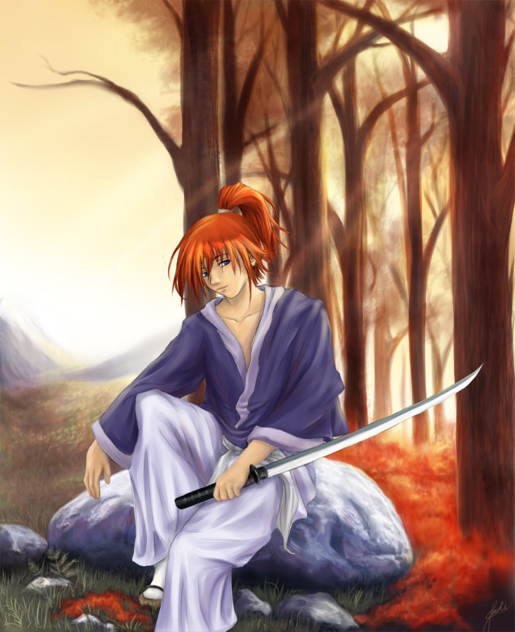 New Finished Image, 116kb, 604 x 741 pixels |
I hope this guide has been helpful in some way. If you have any questions or suggestions for improvement for this tutorial, feel free to contact me at jadeao at gmail.com