General tips for drawing
written by Jade ( http://www.zardec.net.au/aldas/ ) in 2004
Things I've found useful:
Learn some anatomy proportion rules.
These are useful for making sure that your characters don't look distorted. The rules I've heard of are:
• The width between the eyes is equal to the width of one eye.
• The eyes are halfway down the head
• The bottom lip is halfway between the bottom of the chin and the bottom of the nose
• The width of your spread out hand equals to the height of your head.
• The top of the ears (where they join the head) is level with the eyes, the bottom of the ears is level with the mouth.
• The body height can be measured in head heights. An adult male is 8 heads tall, an adult female is 7 and a half heads tall.
The following measurements are for adults. Kids (especially babies) have larger heads compared to the rest of their body.
• From the bottom of the chin to the nipples = 1 head.
• From the nipples to the belly button = 1 head.
• From the belly button to the bottom of the crotch = 1 head.
This equals to half the body of an adult man. Women have the top half being the same number of heads (4), but have slightly shorter legs than males.
• Roughly, the width of the hips = width of the shoulders for females (but there can be exceptions). Males can have wider shoulders than their hips.
Draw lightly.
Something I still have trouble with when using pencil and paper, but thankfully this is much easier when drawing on the computer (you can always reduce the layer's opacity if you draw too hard). Unless you're lucky or very skilled, you probably won't get everything right the first go, so drawing with faint lines means you can try again whilst referring to the past mistake, keep trying with more faint lines till you get it right, then go over the correct lines more heavily.
For life sketching, draw what you see, not what it is.
If you're sketching a person for example, don't think of it as a person or you're likely to draw what you think a person looks like, rather than drawing exactly what is in front of you. Same with trees – don't draw individual leaves unless you see them, draw areas of light and shadow. A good practise for life sketching is to get some pictures of people from a magazine or newspaper, turn them upside down, and draw them like that (this helps to stop you from seeing them as a person rather than a group of lines and tone). When you turn your drawing around so that the person's up the right way, they'll probably look quite weird and lopsided (sometimes they can look like comical caricatures, which can be fun when you're drawing politicians). Keep doing this however, and you'll hopefully start drawing more accurately, with your sketch more closely matching what you see.
Use reference photos when needed.
Even if you prefer a comic style of drawing that has a distorted, unrealistic anatomy, looking at photos is still a useful way of making your image look natural. They'll show you how the human body is naturally positioned, the way cloth hangs on the body, and things like the different appearance of jean folds compared to the folds of a softer fabric. Looking at good quality art (of any style) is also a good way to understand how things can be drawn (especially since they often simplify the forms to a more easily understandable level), though keep in mind that they may be quite different to real world physics and proportions.
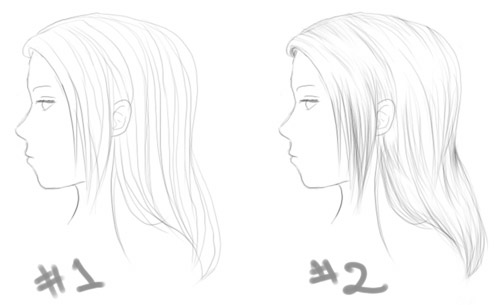
Hair strands that extend from the top of the head to the bottom of the hair are less realistic & look flatter (see #1).
This applies to both real-life and cartoon drawings. If you look closely you'll see that individual hair strands can't be observed travelling all the way down, they get hidden behind other strands and are hard to tell apart (especially in parts reflecting light). So when you're drawing in hair strands, try drawing them only in certain places, especially in areas receiving less light. This adds the effect of shading and volume to the hair as well (see #2).
To check your drawing, flip it horizontally.
If you're using a computer program, do this by finding the 'flip canvas horizontal' option. If you're drawing on paper, turn your page over and hold it up to the light so you can see the lines. A lot of the time, the image will look a bit strange and lopsided. You may have drawn what you thought was a tree standing vertically upright, but after flipping it you find it's leaning to one side. This is a good method for checking your character's anatomy, since flipping it reveals a lot of mistakes that you didn't notice before.
Some technical terms:
Hue = colour
Tone = light/darkness
Complimentary colours = opposing colours. They make brown if you mix the two together. Eg: red+green, yellow+purple, blue+orange. They can be useful for making parts of a picture stand out – eg, a mostly blue image could have a few small orange parts in it.
I'll add to this list if I think of more. Feel free to suggest things too!
email: jadeao at gmail.com